hORSEHILL VINEYARDS REBRANDING
Description:
Horsehill Vineyards was looking to update their label and opened up a contest, where the winners label would be the new face of the wine. Horsehill Vineyards is a wine collaboration between Cal Poly Pomona and South Coast Winery. I worked in a team with 3 other designers over the span of 15 weeks to rebrand their identity. Initially we were to create a new updated logo that showed school pride as well as paid tribute to the wines history. We went a step further and delivered a whole new rebranding for Horsehill including the label, packaging, and a new logo mark. The result was our design being chosen and put into production to be the new label of Horsehill Vineyards which is now out in the market.
Group Members:
Brandon Logan Sarah Martinez - Kazu Iwasawa
Client:
Margie Jones

Research:
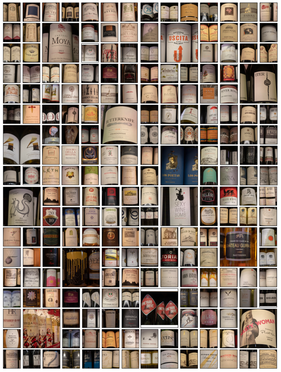
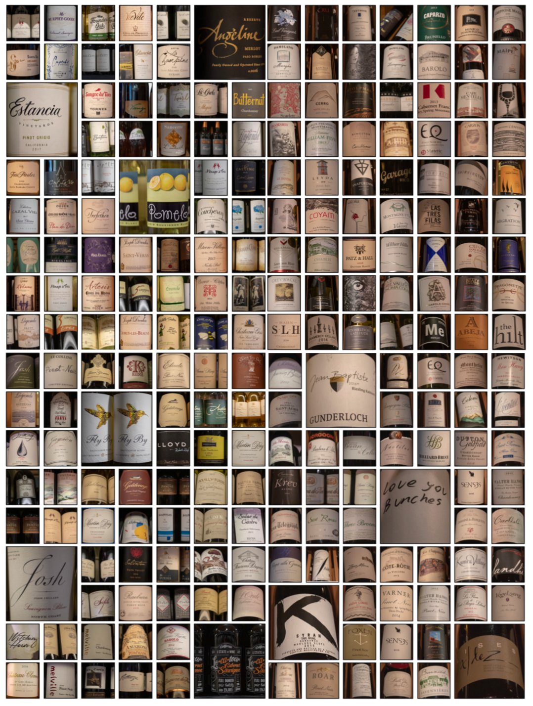
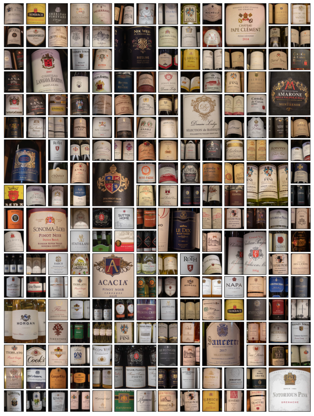
As part of our initial research I was tasked with going out and photographing 1,000 images related to wine. I had four categories for my photos to fall under. The categories were general labels, hand-written labels, heritage labels, and the ecosystem they were sold in. From this research we learned what our competitors were doing with their label design and both what was working and what wasn’t working. We were also able to see trends within the labels. Such as for Zinfandel’s it was typically a white label on a dark bottle.

Phase one:
We had our meeting with the client who told us what they wanted the label to represent. What we took from it where 3 main factors. They wanted Cal Poly Pomona’s heritage to be represented, the idea of collaboration, and the negative stigma towards alcohol to be addressed. We took their comments and these 3 main points and we all started to design separate to see how each of us interpreted their words and how we would show it visually.
Logo and Packaging Design:
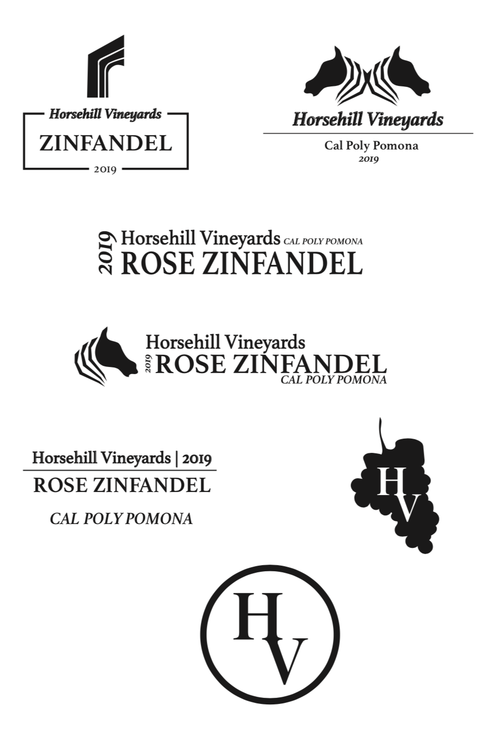
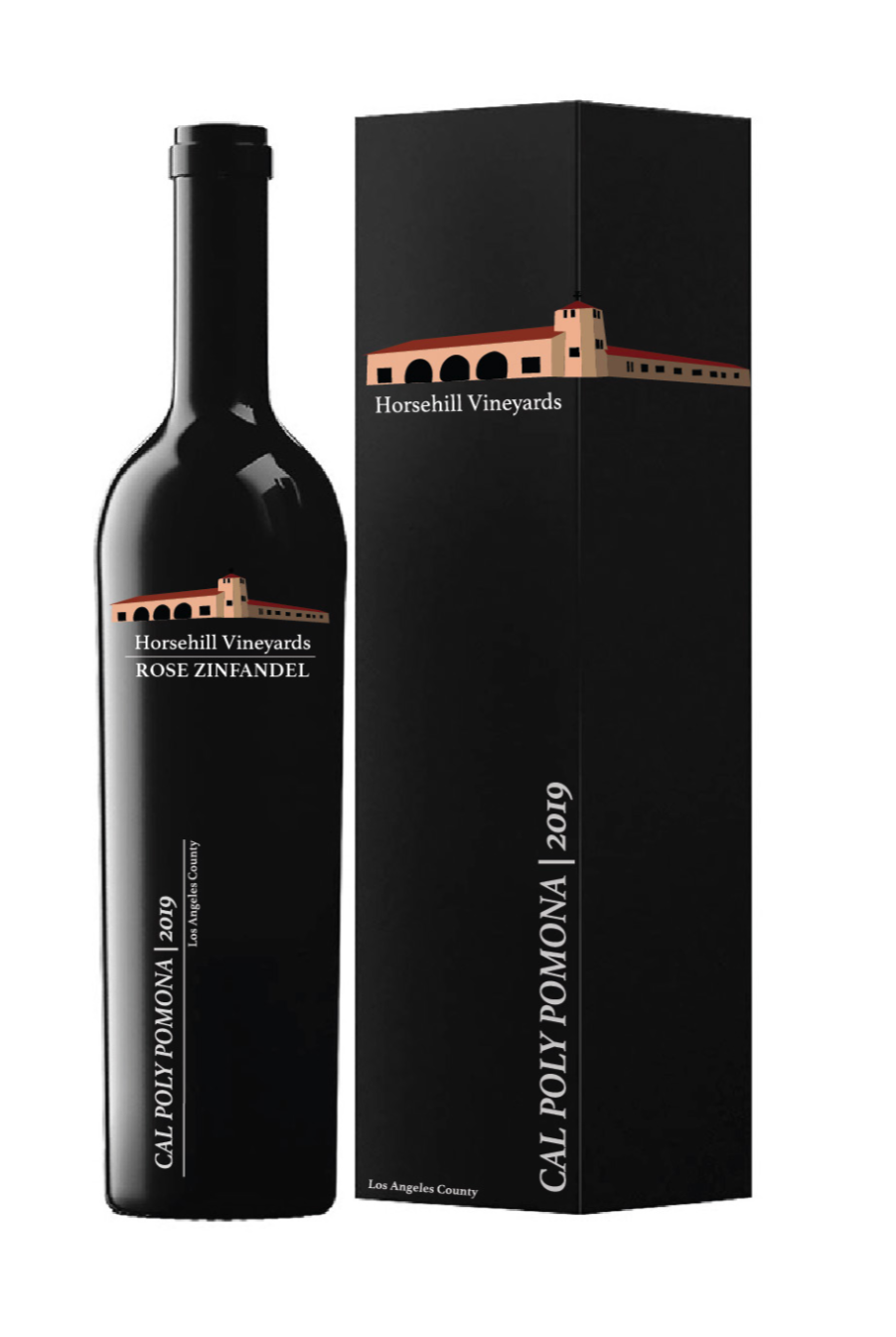
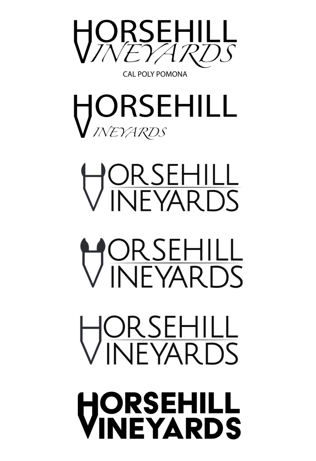
These were some of the first designs that I came up with. The horse head was meant to be a stand in until we, as a team, would come up with a logo to represent Horsehill. With the clients words in my head I was focused mostly on playing with the typography. I originally thought it would be a good idea to have the label horizontal as that is the proper way to store wine. In this phase I played with designing a logo for Horsehill using the “H” and the “V” as a starting point.
Going off the labels I designed in the beginning phase
I wanted to see how they would actually look when put on the bottle. Once I put them on the bottle, ideas of how the box design would look started running through my head so then I started to design the boxes along with the wine bottles. These were three of my favorite designs and I really enjoyed making the packaging come to life and the way the box would be complementing the bottle that it would hold.
I wanted to see how they would actually look when put on the bottle. Once I put them on the bottle, ideas of how the box design would look started running through my head so then I started to design the boxes along with the wine bottles. These were three of my favorite designs and I really enjoyed making the packaging come to life and the way the box would be complementing the bottle that it would hold.

Phase two:
After meeting with the group and presenting our material to one another we started to pick what we liked about each-others. From my designs they liked the simplicity yet elegant factor they brought and wanted me to keep pushing it further. We decided as a team that we wanted a geometric pattern involved in our label to counteract the negative stigma towards alcohol. We also decided on incorporating the schools colors so that our wine label would be identifiable as coming from Cal Poly Pomona.
Refining:
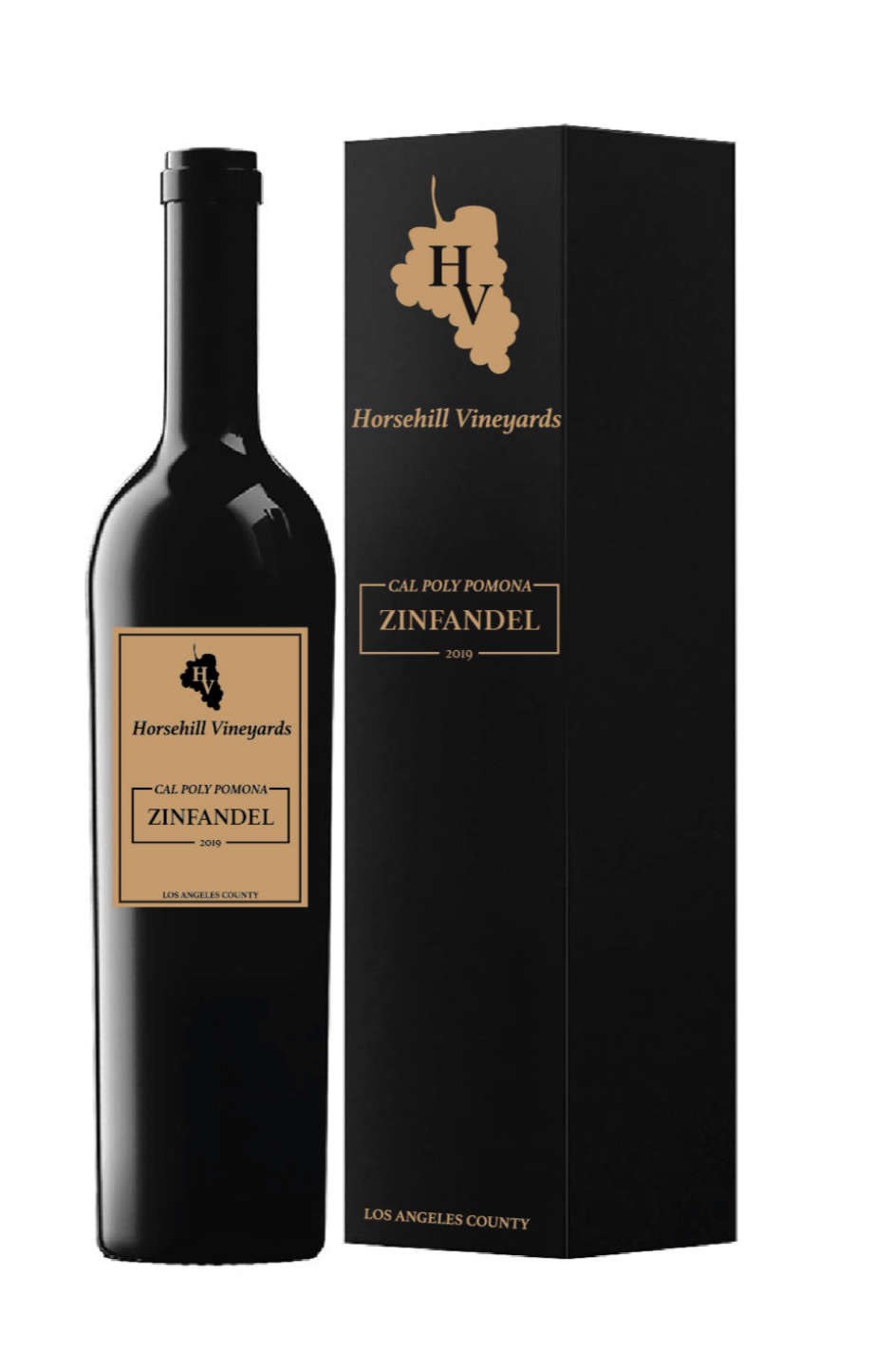
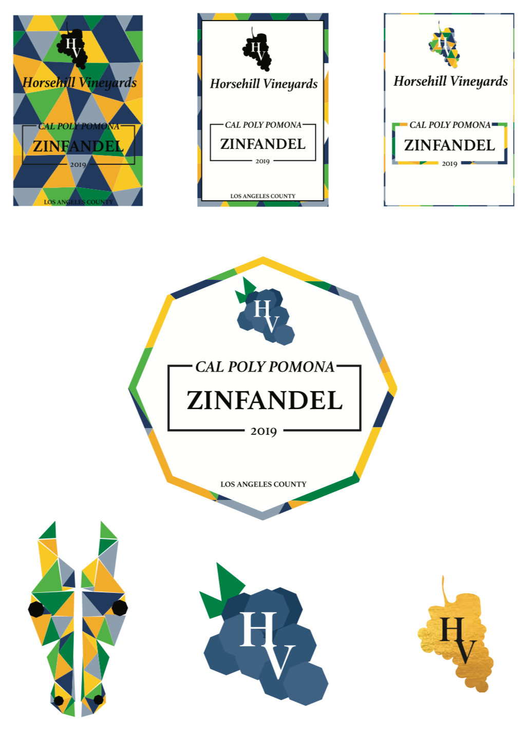
Using the critique that my group gave me during the first meeting, I pushed my original rectangular label further. I introduced the geometric pattern along with the incorporation of Cal Poly’s colors. I tried to use the geometric pattern within the grape but it made the “HV” almost impossible to read. I used the same typography and tried it within the octagon shape which I got inspiration for from our new school logo. I also tried to push my idea for Horsehill Vineyards logo by repeating the octagon to create the grapes but ended up just masking a gold foil onto my original grape design. The horse head I thought was a good idea but too many groups were using the easy way out of making a horse the logo.
Since I enjoyed creating the whole design for the wine bottle and the packaging, I made a new design based off my new label. I picked my favorite logo out of all the variations I made and went with it. This label is based off my original brown logo from the first phase just inverted. To push it further I made the border have the geometric pattern along with having the Horsehill logo with a gold foil affect.
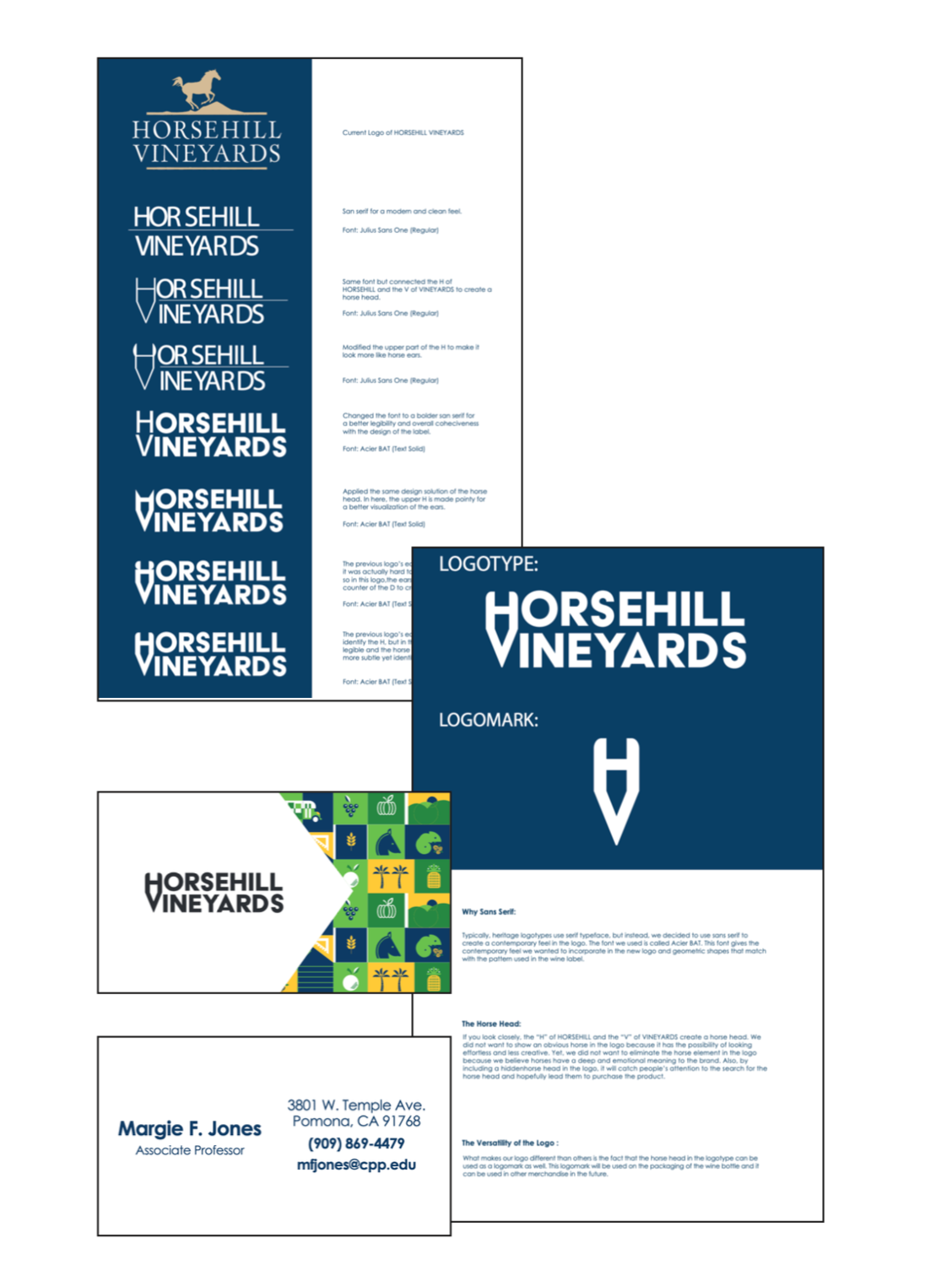
Logotype Creation:
The idea for our logo came spontaneously to us while we were designing. I realized that the “H” in Horsehill and the “V” in Vineyards, when put together, created an abstract version of a horse head. Pushing this idea further we modified the type and added ears to the “H” so that it could be more identifiable as a horse head rather than misplaced type. Eventually we decided on a typeface that complimented our design and we ended up with a logo mark that can stand alone and represent Horsehill or can be used with typography and still work.
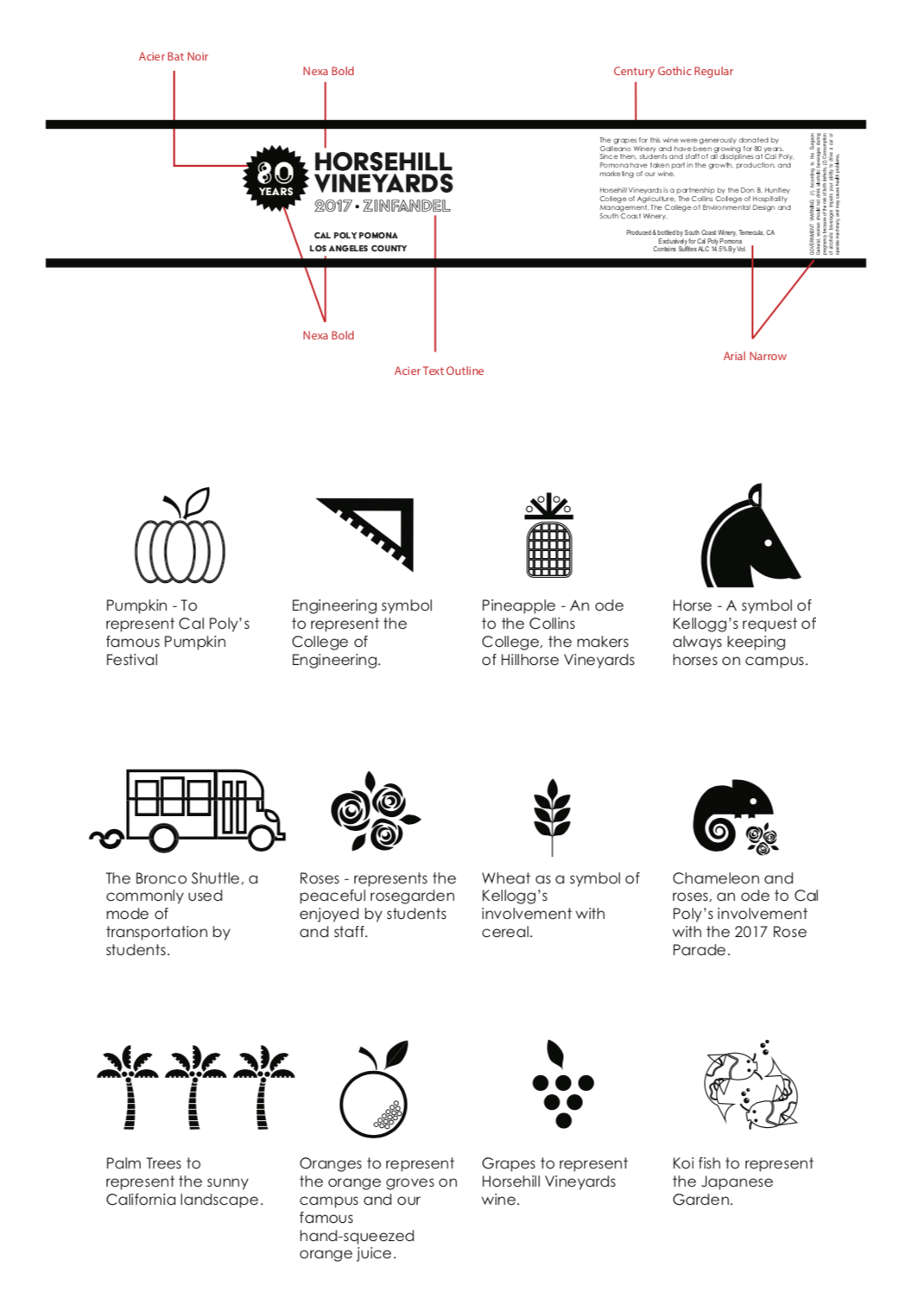
Label Breakdown:
Finally having a logo in place to represent Horsehill we focused on the messaging behind our label and creating a universal brand for our wine. The symbols found on our label each have a story behind them that have roots within Cal Poly Pomona. We wanted both alumni and current Cal Poly students to have a connection with the bottle. We decided to make our label to be a full wrap around so that the symbols could be fully visualized. We also realized that every other team was doing a front and back label and having a full wrap would help our design to stand out.
First Presentation:
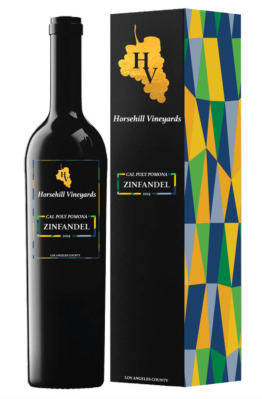
Finally after weeks of creating our label and brand for Horsehill Vineyards we had to pitch our idea to Margie. Come presentation day we wanted to show her more then just a label so we put together a brand guide displaying our colors and type that we would use throughout our marketing of the vineyards. Also included within our presentation were letter heads and business cards so that she could see how far we can expand her brand. On our first presentation label we had all the typography in gold foiling on top of a full bottle sleeve that had our symbols in a geometric pattern. Our label was the most colorful out of the class.
Using the new geometric pattern in full color, along with my original idea for my packaging, I came up with this final box design to present to Margie. My team wanted a dark blue box to go with the coloring of our label but I liked the contrast between the black and the color. At this part in the process packaging was our main concern and we needed to go to the next step of making a physical package that we could actually touch and see how it would work for the next meeting.

Final Phase:
From the first meeting we learned that Margie liked the story we had behind each symbol and how our label was easily identified as being part of Cal Poly Pomona. One concern that she voiced with our label design, was that she felt it was too busy and needed to be simplified. One major concern that she told everyone was that she wanted to see the packaging that the wine would be put inside.
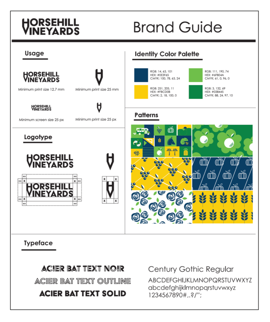
Brand Guide:
This was our final brand guide. Within it is every aspect of our brand that would be carried out through every aspect of Horsehill. We laid out every type face, color, and design that would help the brand to stay as a unified whole. Therefore if Margie, wanted something designed that we don’t have for her, the designer she hires would have a basis of where to start from so that it would stay within our branding. We added new patterns based off of some of our symbols to give our brand some diversity so that we didn’t have to solely rely on our main pattern.
Physical Prints:
As with the first time we presented to Margie we wanted to again include physical printouts for her that she could hold and read. Included in these prints was a poster covering the evolution of the old logo to our new logo and the steps in between. This was so that she could see our thought process and see how we came up with the final logo. The second poster was of our final logo and the story behind it so that after the presentation she would still be able to tell our brand story. Along with the two posters we had business cards with all of her personal information on it already so that she could first hand see how her business would be represented with the new branding.
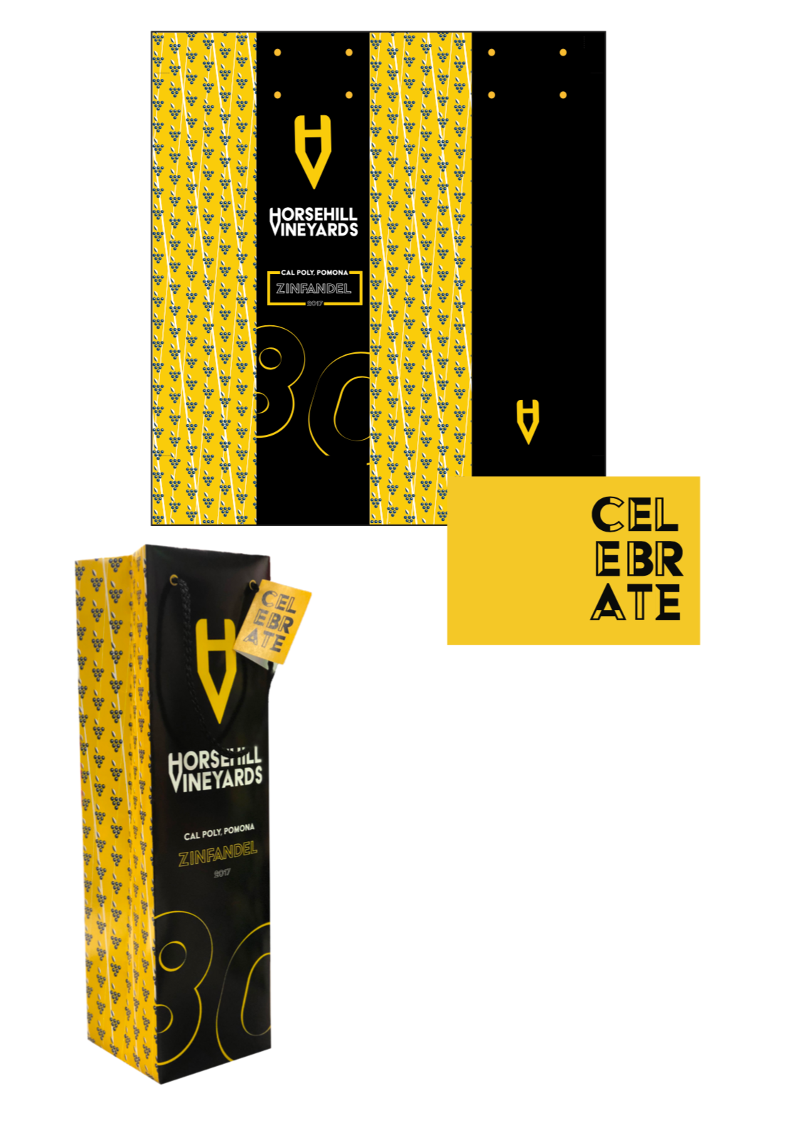
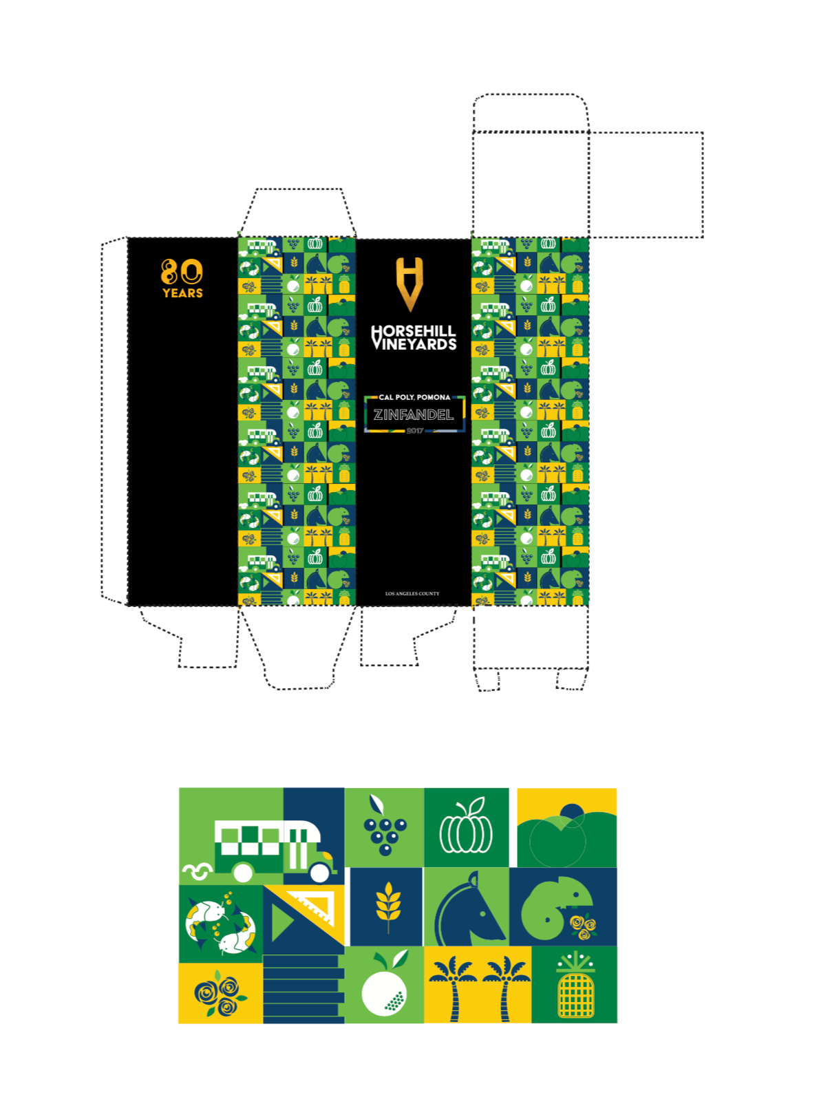
Anniversary Packaging:
At our first meeting with Margie she made it known that she wanted packaging the next time we saw her. With the wine being an anniversary bottle we needed to make sure we accounted for that since we didn’t make it such a big emphasis on the wine label itself. To make the anniversary significant I designed a bag specifically for the anniversary. This bag is sophisticated yet simple and has an emphasis on the anniversary year with the big 80 on the front of the bag. The bag being black would be a good contrast to the bright geometric bottle that would be held inside.
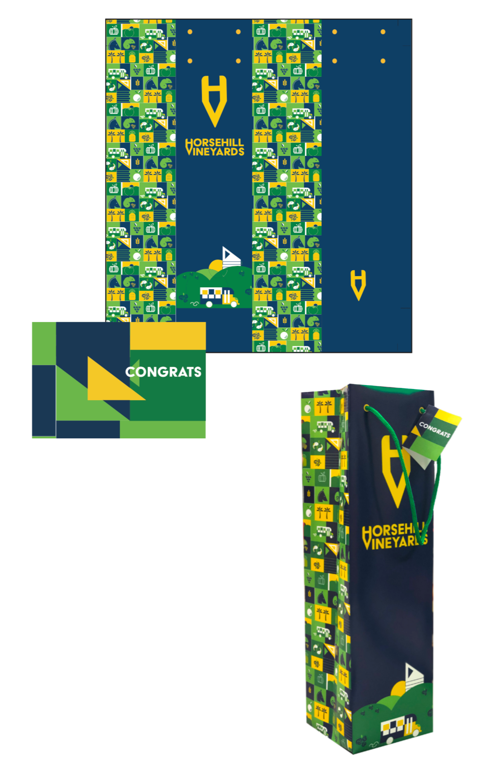
Generic Packaging:
Our team wanted to make the brand timeless so the packaging we designed needed to last for years to come where as some teams label you would only be able to use for the anniversary wine. This packaging was focused on being a bag that would be used for every year that wasn’t particularly special for the wine. The bag is blue to match our original color scheme. The front design is a scene that was made from using a combination of our original symbols that we used on the label of the wine.
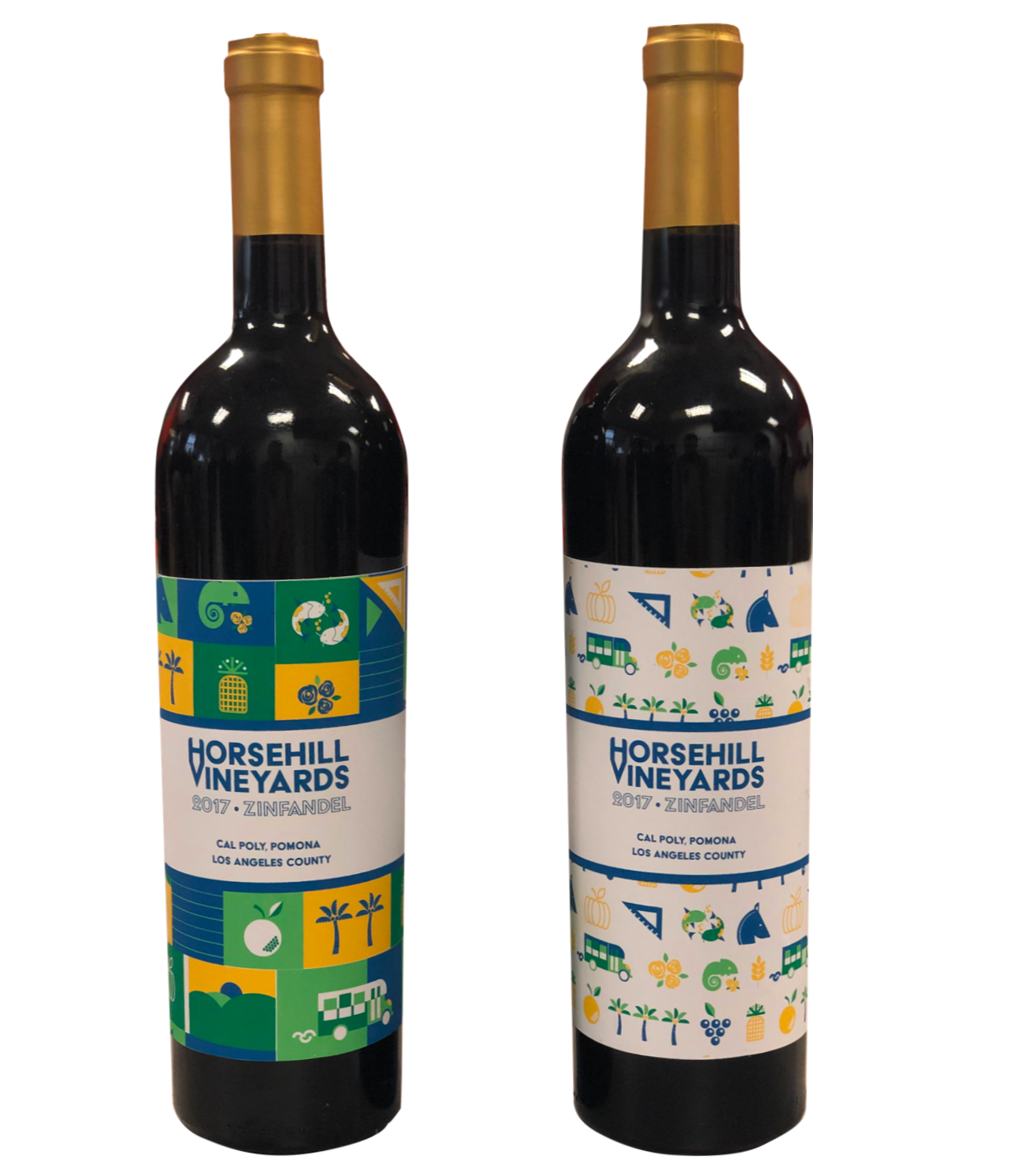
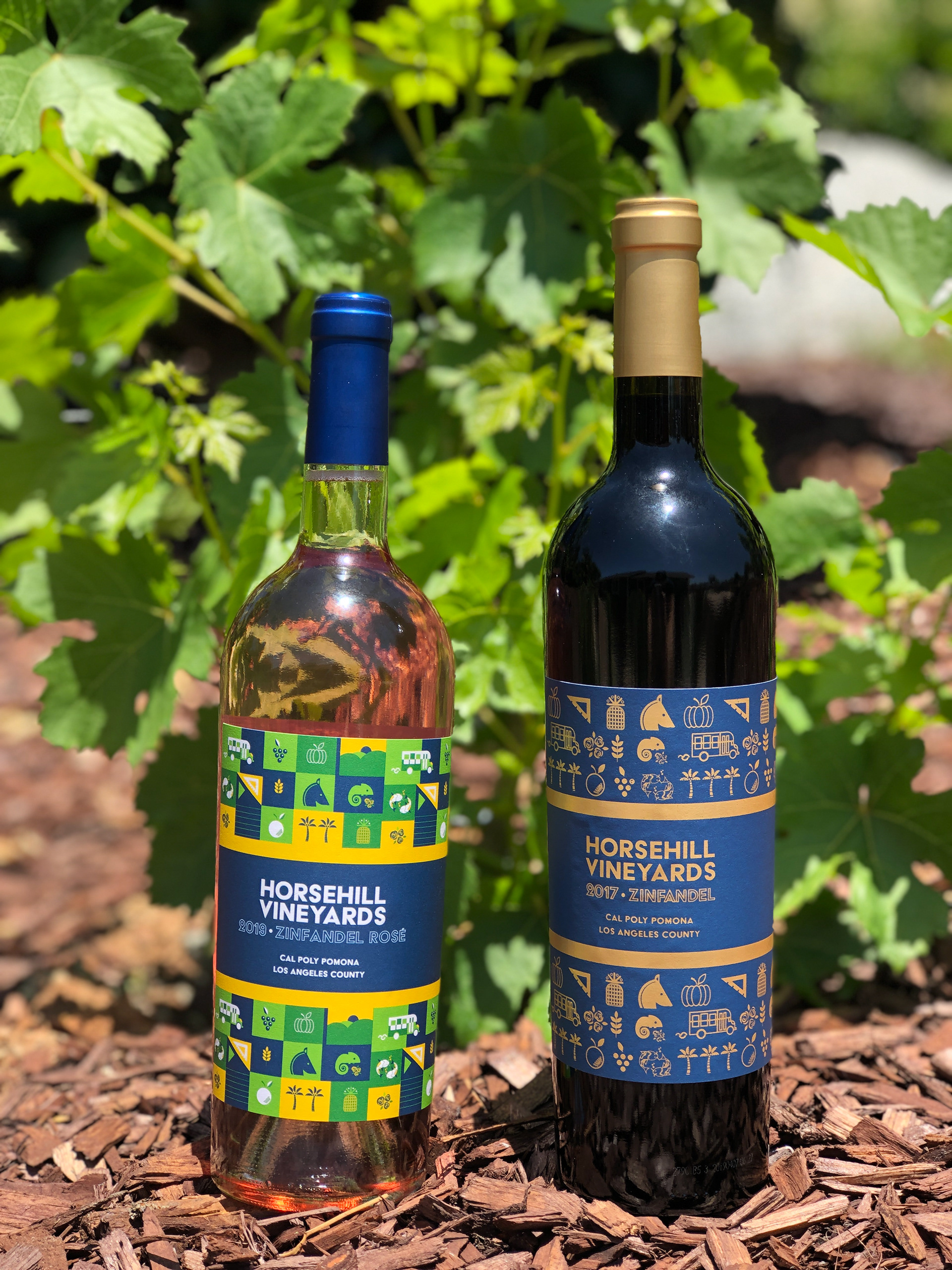
Final Labels:
These are our final labels that we presented to Margie to be in the running to be on next years wine. Overall we stayed true to our original ideas. The pattern is geometric with the color scheme of the school to both battle the negative stigma towards wine on our campus and to be identified as coming from Cal Poly Pomona. We presented two labels to Margie so that she could see the diversity of our wine label. If the label with the geometric pattern was still too busy for Margie then we showed her the all white label showing that our symbols are still visible but the label gives the viewers eyes more time to rest. Both labels represent Cal Poly Pomona and stood out from the rest of the groups as they tended to stay more towards the traditional labels that you would find on this kind of wine.
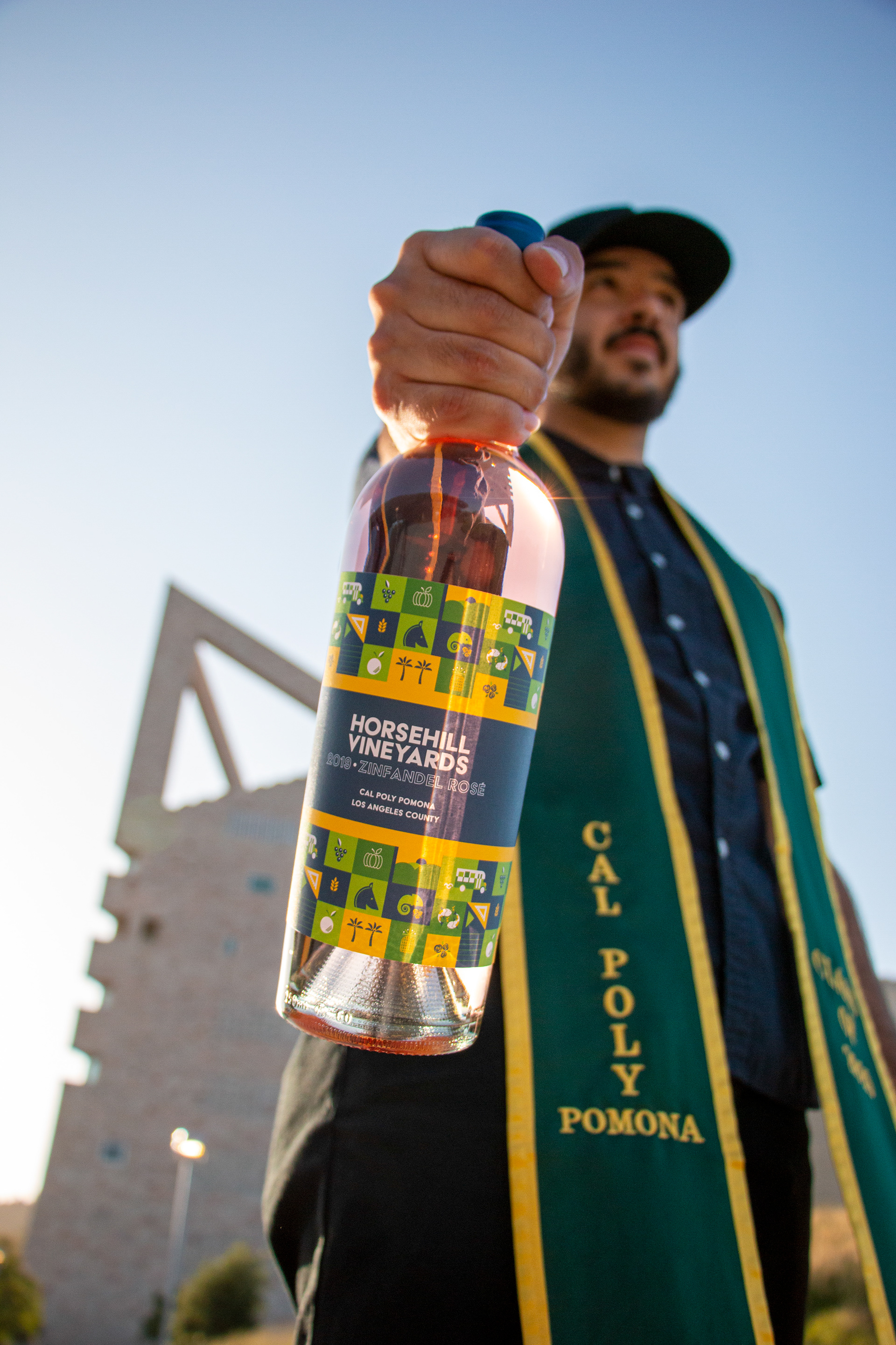
Completed Product